Composites are a very common method used in atmospheric. Take a continuous index, discretise it into two categories defined by some threshold and then compute the mean anomaly for each category. Many researchers use this to show the “typical” expected value for “events”, such as the effect of El Niño events on precipitation. Sometimes it’s also used to try to find non-linear effects by comparing composites for positive and negative events (e.g. El Niño and La Niña events).
Figure 1 is an example. It shows composites of wintertime precipitation anomalies for El Niño and La Niña years, defined as winters with mean Sea Surface Temperatures in the Niño 3.4 region (that’s the ONI index) than 0.5 or lower than -0.5 respectively.
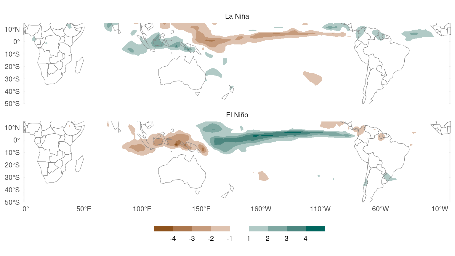
Figure 1: Observed (1979 – 2019) austral winter composites of precipitation anomalies for La Niña and El Niño winters.
They seem to indicate that precipitation anomalies associated with La Niña are somewhat waaker and less extensive. This would suggest a non-linear effect in which the effect of negative Niño events is not the same as the negative of the positive Niño events. However, this is an illusion.
I am not a fan of composites for three reasons:
By selecting “events” using a threshold, composites discard a lot of perfectly good data.
Estimation of non-linear effects is much harder and noisier than of linear effects, so you need a lot of data. But we usually don’t have as much data as we want and, even then, this method is not data-efficient (related to 1).
Results can be very sensitive to the chosen thresholds.
The mean value of a variable conditioned on an event depends on the mean intensity of the events.
Composites are data-inefficient
Table 1 which shows the number of years in each phase.
| Phase | N |
|---|---|
| Neutral | 29 |
| El Niño | 6 |
| La Niña | 6 |
The original wintertime ONI index has 41 data points (years), but only selecting years that are larger than 0.5 or lower than -0.5 throws away more than 2/3 of the data. This is terribly data-inefficient.
The composites of El Niño and La Niña years in Figure 1 are based on only 6 years each. This is extremely tiny data, which translates to huge uncertainty in the computed means. To illustrate this, Figure 2 plots maps of the lower and upper values for the 95% confidence intervals from a t-test. According to these composites, both El Niño and La Niña are compatible with zero signal in the precipitation in the central Pacific.
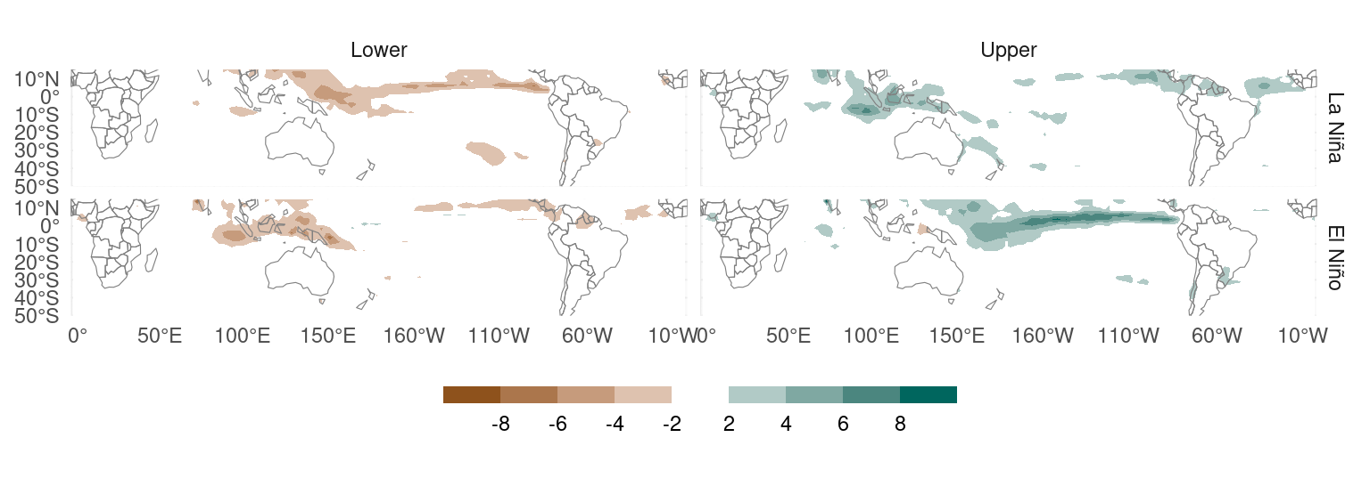
Figure 2: Lower and upper values for 95% confidence intervals from a t-test comparing the mean precipitation anomaly in El Niño and La Niña years.
Non-linear effects are harder to estimate than linear effects
If these composites have a hard time detecting the (gigantic) zero-order effect of El Niño, even less can they detect any non-linear effects. Indeed, the differences between the composites are not statistically significant.
Figure 3 shows the result of a t-test on precipitation anomalies during El Niño years and negative precipitation anomalies during La Niña years to test if the effect of El Niño is not significantly different from the negative effect of La Niña. The differences are barely significant at very few locations and the significance completely vanishes if one controls for multiple comparisons (Walker 1914; Wilks 2016).
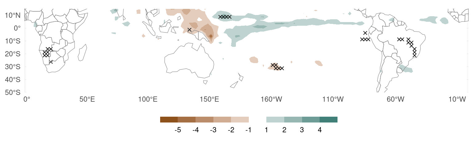
Figure 3: Difference between the mean precipitation anomaly in El Niño winters and the negative precipitation anomaly in La Niña winters. Crosses indicate raw p-values lower than 0.01.
This indicates that, using composites, precipitation anomalies during El Niño are almost indistinguishable to precipitation anomalies during La Niña reversed in sign.
Composites depend on an arbitrarily-chosen threshold
The ±0.5 threshold used to define El Niño and La Niña years is arbitrary. There’s no reason to think that the atmosphere cares that much if the ONI is 0.45 vs. 0.55.
Figure 4 shows the same composites as Figure 1 but using ±0.1 instead of ±0.5 to define the phases. These composites seem to suggest that precipitation anomalies are actually more sensitive to La Niña than to El Niño.

Figure 4: Same as Figure 1 but for El Niño and La Niña defined using a ±0.1 threshold.
Changing the threshold to ±0.3, however, now suggests no difference (Fig. 5).
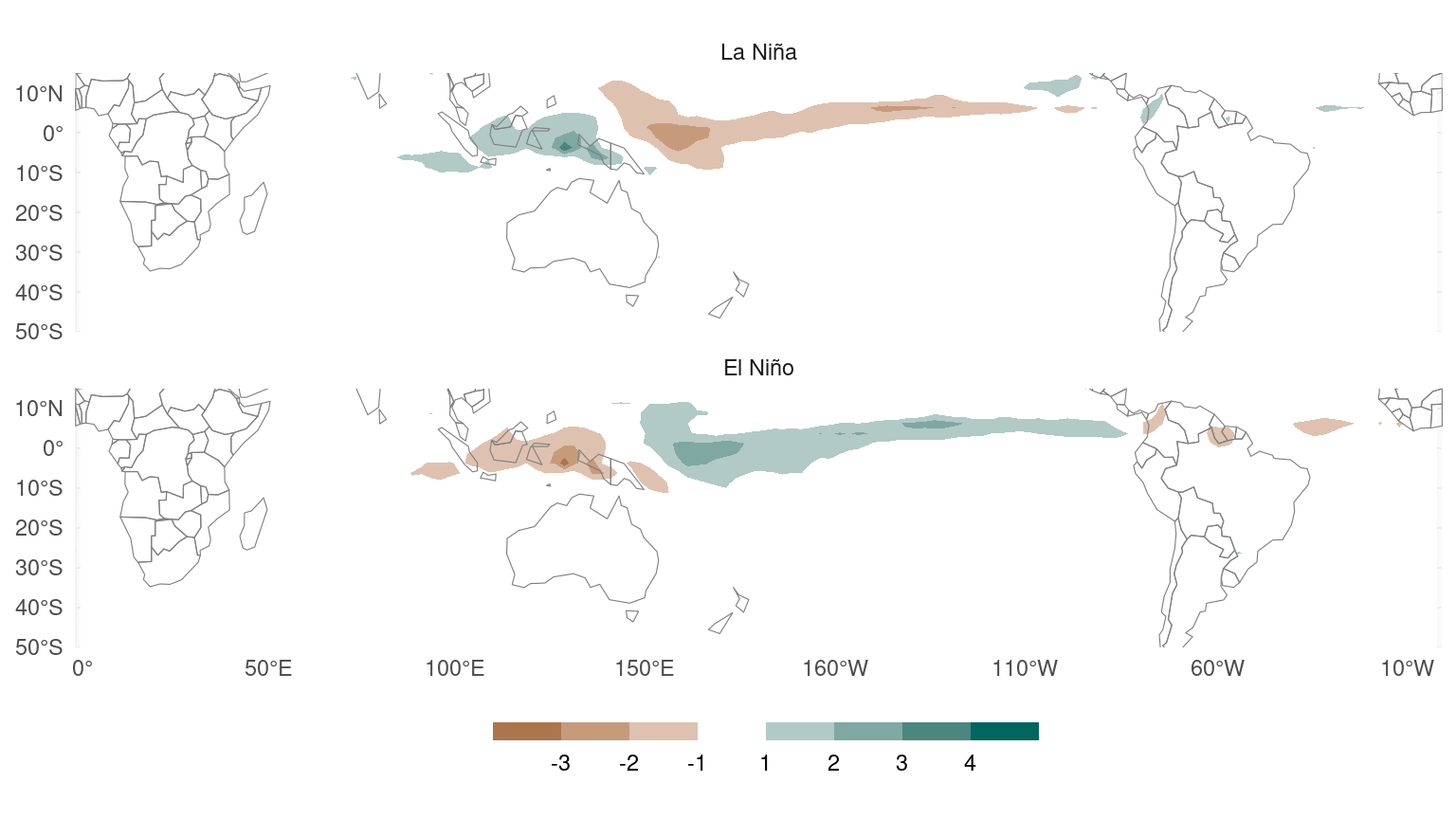
Figure 5: Same as Figure 1 but for El Niño and La Niña defined using a ±0.3 thershold.
Composites don’t actually show the relationsip between variables
Technically what these plots are showing are, for each cell in the map, the expected value of precipitation anomalies conditioned on the ONI index falling into the El Niño or La Niña categories. Crucially, it doesn’t tell us how much precipitation increases or decreases when the ONI increases or decreases by 1 unit.
This is shown in cartoon form in Figure 6.
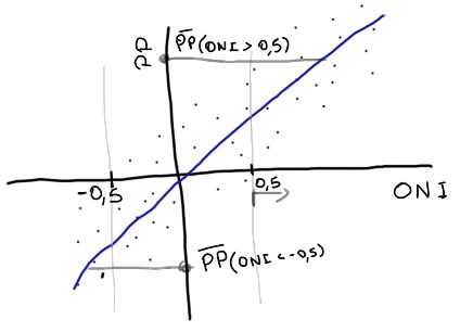
Figure 6: Sketch showing a hypothetical linear relationship between ONI and precipitation anomalies at some point and the values of the mean precipitation anomalies for year with ONI greater than 0.5 or lower than -0.5.
In this fake example, the ONI index has larger mean magnitude in El Niño years than in La Niña years. In other words, the typical El Niño is stronger than the typical La Niña. So even though the relationship between precipitation and the ONI index is linear, the typical precipitation anomaly during El Niño is stronger than the typical precipitation anomaly during La Niña.
Table 2 shows the mean mean magnitude of the ONI index during El Niño and La Niña years. Evidently the ONI index has greater mean magnitude during El Niño than La Niña. Therefore, composites using La Niña years will have smaller values (in magnitude) than composites using El Niño years even if the relationship were linear.
| Phase | ONI |
|---|---|
| El Niño | 1.16 |
| La Niña | −0.89 |
Figure 7 illustrates this effect on fake composites. Here I’ve created fake precipitation fields so that they have a perfectly linear relationship with the ONI index. However, the composite of La Niña years shows weaker anomalies than the composites of the El Niño years. In other words, these plots suggest a non-linear effect even though the relationship is linear by construction.
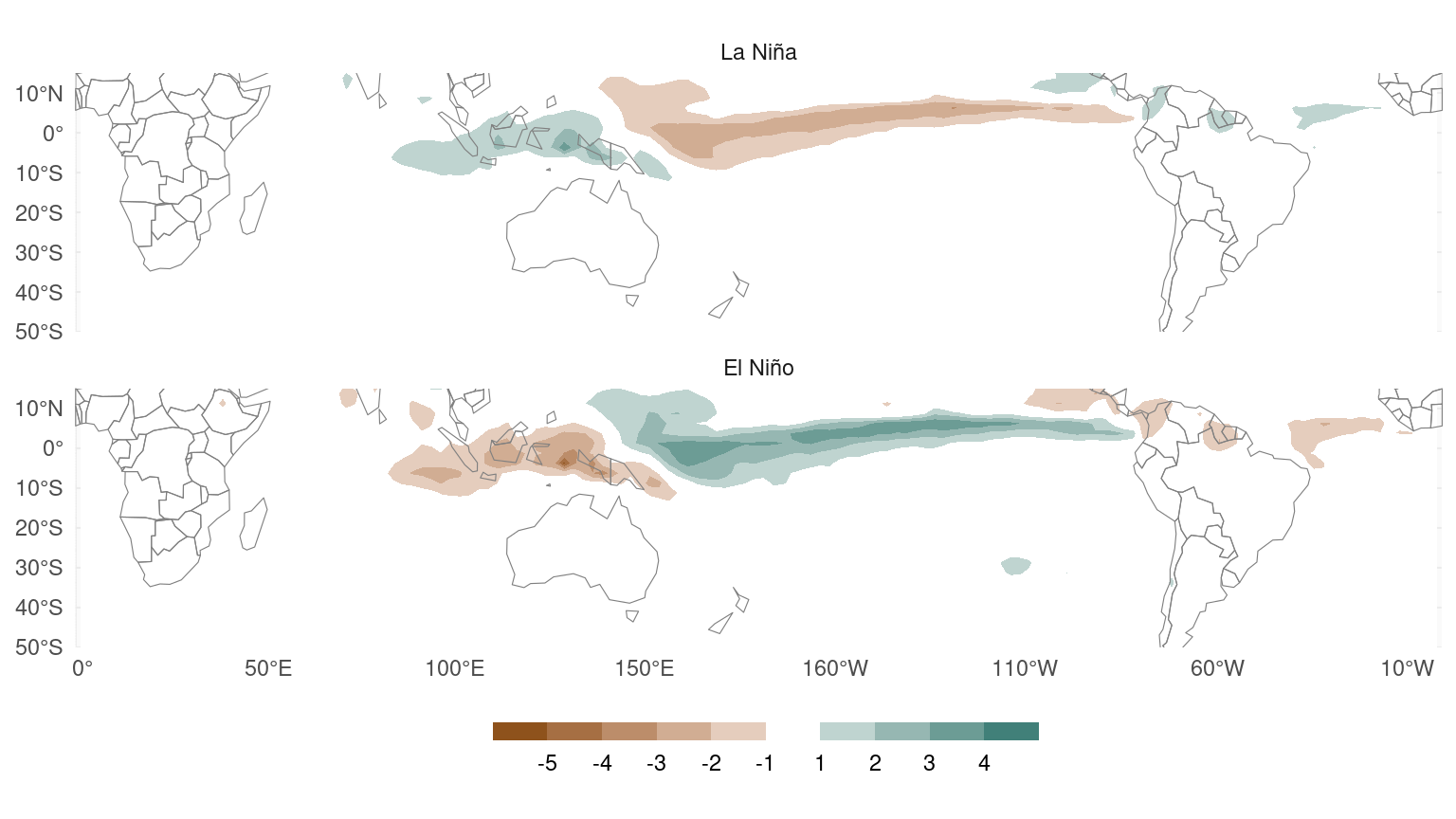
Figure 7: Same as Figure 1 but from synthetic precipitation anomalies that are perfectly linearly related with ONI by construction.
This problem can be corrected by normalising the composites by the absolute value of the mean ONI for each phase, like I did in Figure 8 using real precipitation fields. In this figure, the map show the expected increase or decrease in precipitation due to a unit change in the ONI index in La Niña or El Niño years and suggest that precipitation anomalies are not more sensible to El Niño than La Niña.
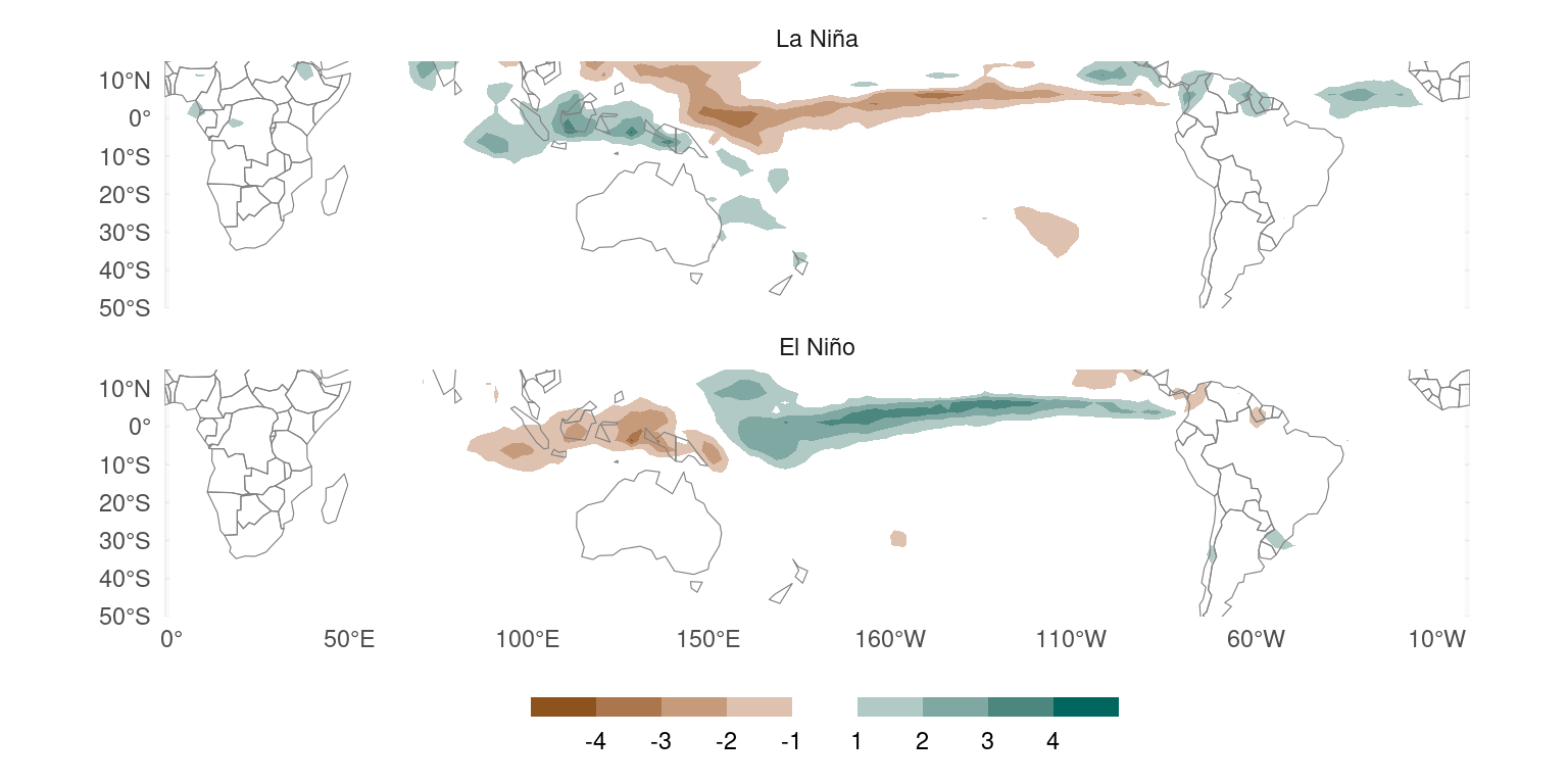
Figure 8: Same as Figure 1 but the composites are divided by the absolute value of the mean ONI in each phase.
Use piecewise regression instead
Composites throw away a lot of precious and perfectly good data, can’t actually detect non-linear effects unless they are really strong, and don’t actually show the relationship between the variables. So what’s the alternative?
An alternative is to compute simple linear regressions or correlations using all the data and don’t bother with trying to find non-linearities in relatively small datasets. The sooner we accept that in many cases we only (barely) have enough data to estimate first-order effects, the better.
But if you really want to look for non-linearity, then fit a piecewise regression with the breakpoint at zero. This will give you a slope for negative values and a slope for positive values. Each slope will be computed using all the (positive or negative) values and the line will be continuous at zero.
So, in this case, piecewise regression will give you an estimate of the change in precipitation when the ONI changes in one unit for positive values (~ El Niño) and negative values (~ La Niña) without discarding precious data, depending on arbitrarily chosen thresholds, nor suffering from the mean value issue.
Piecewise regression is also not hard to compute when the breakpoint is fixed, like in this example. You just need to fit the linear regression:
\[ pp \sim ONI + (ONI - ONI_0)\times I_{ONI\le ONI_0} \]
Where, \(ONI_0\) is the breakpoint value (0, in this case) and \(I_{ONI\le ONI_0}\) is an indicator function that is 1 when \(ONI\le ONI_0\) and 0 when is not (this translates simply to ONI <= ONI0 in any statistical software).
Using this formulation, the first regression coefficient corresponds to positive ONI and the second regression coefficient corresponds to the difference between positive ONI and negative ONI.
This means that piecewise regression directly computes the statistical significance of the difference between the slopes, providing you with a number to detect those pesky non-linear effects. (Although, again, you probably don’t have enough data to detect them and, since piecewise regression fits more parameters, estimates will be noisier than simple linear regression estimates; you really need to look out for type S and type M errors.)
Figure 9 shows the result of piecewise regression applied to the relationship between ONI and precipitation (in that plot, I’ve flipped the sign of the La Niña values to match the composites).
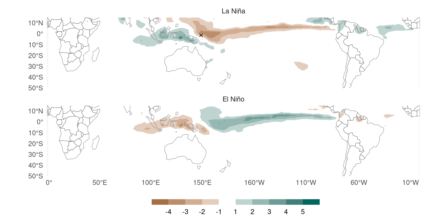
Figure 9: Linear regression slopes for positive and negative ONI values using a piecewise linear model with fixed breakpoint at ONI = 0. Crosses indicate raw p-values lower than 0.01 (yep, there’s only one).
This figure shows that the effect of La Niña on precipitation is of similar magnitude to the effect of El Niño. The difference between the two signs of ONI is basially not significant even before ajustinf for multiple comparisons.
tl;dr
So, composites throw away perfectly good data, can’t detect non-linear effects reliably, are not always robust to threshold choice and don’t actually show the relationship between the variables. Don’t use them.
In most cases, it’s better to use simple linear regressions (or correlations) to study first-order linear effects, as you probably don’t have enough data to reliably detect non-linearities. I If you really want to check for non-linear effects, piecewise regression uses all the data and will even provide statistical significance of the difference.