
Statistical metamerism
En español: Metamerismo estadísticoSummary
The metamer package implements Matejka and Fitzmaurice (2017) algorithm for generating datasets with distinct appearance but identical statistical properties. I propose to call them “metamers” as an analogy with the colorimetry concept.
Metamers in vision
This is not a prism separating white light into its component wavelengths. It is an image of a prism separating white light into its component wavelengths.

Fig. 1: C’est ne pas un prisme.
This is not just a Magritte-style observation. The important distinction comes into play when you realise that the monitor you are looking at has just three LEDs that emit light in just three wavelengths (sort of). How can it still reproduce a full spectrum of light? It doesn’t. For each (approximately) monochromatic colour in that rainbow, your monitor is actually emitting an unique mixture of red, green and blue light that tricks your visual system (and mine) into seeing the colour associated with that wavelength.
How that works is unreasonably complex and beyond what I can explain in this article (I do recommend this amazing article, though) but the core insight is that our eyes have only three colour receptors that are sensible to wide range of short (S), medium (M) and long (L) wavelengths. Any spectrum distribution that reaches our eyes is reduced to just three numbers: the excitation of the S, M and L receptors. Hence, any spectrum distribution that excites them in the same way will be perceived as the same colour, even if they are wildly different. In colorimetry this is known as metamerism (Hunt 2004). The monochromatic yellow emitted by the prism looks to you identical as the red, green and blue mixture emitted by of your monitor even though their spectrum distribution is not even remotely similar. They are metamers.
Coming up with metameric matches is the basis for colour reproduction in computer screens, printing and painting, but it also has a dark side. Two pigments can be metameric matches under certain light conditions but have very different colours when illuminated with another type light. This can be a problem, for example, when buying clothes in a store with artificial lighting and then wearing them outside.
Metamers in statistics
Now let’s focus our attention on the famous Anscombe quartet
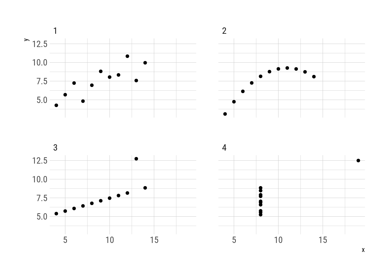
Fig. 2: Anscombe quartet
Even though they are very different datasets, the members of the quartet have the same mean and standard deviation of each variable as well as the correlation between the two (Anscombe 1973). From the point of view of that statistical transformation, the four datasets look the same even though they are not even remotely similar. They are metamers.
And exactly the same as metameric colour matches, statistical metamers reveal their differences when viewed under a new light. In this case, when plotted.
The concept of “data with different graphs but same statistics” is still relevant, with multiple published papers describing methods for their creation (e.g. Chatterjee and Firat 2007; Govindaraju and Haslett 2008; Haslett and Govindaraju 2009; Matejka and Fitzmaurice 2017). In this post I will use the term “metamers” to refer to sets of datasets that have the same behaviour under some statistical transformation as an analogy with the colorimetry concept.
The metamer package implements Matejka and Fitzmaurice (2017) algorithm to construct metamers. The main function, metamerize(), generates metamers from an initial dataset and the statistical transformation that needs to be preserved. Optionally, it can take a function that will be minimised in each successive metamer.
First, the function delayed_with() is useful for defining the statistical transformation that need to be preserved. The four datasets in the Anscombe quartet share these properties up to three significant figures.
library(metamer)

summ_fun <- delayed_with(mean_x = mean(x),
                         mean_y = mean(y),
                         sd_x = sd(x),
                         sd_y = sd(y),
                         cor_xy = cor(x, y))
summ_names <-  c("$\\overline{x}$", "$\\overline{y}$",
                 "$S_x$",  "$S_y$", "$r(x, y)$")

anscombe[, as.list(signif(summ_fun(.SD), 3)), by = quartet] %>%
   knitr::kable(col.names = c("Quartet", summ_names),
                escape = FALSE,
caption = "Statistical properties of the Anscombe quartet.")| Quartet | \(\overline{x}\) | \(\overline{y}\) | \(S_x\) | \(S_y\) | \(r(x, y)\) |
|---|---|---|---|---|---|
| 1 | 9 | 7.5 | 3.32 | 2.03 | 0.816 |
| 2 | 9 | 7.5 | 3.32 | 2.03 | 0.816 |
| 3 | 9 | 7.5 | 3.32 | 2.03 | 0.816 |
| 4 | 9 | 7.5 | 3.32 | 2.03 | 0.817 |
To find metamers “between” the first and second quartet, one can start from one and generate metamers that minimise the mean distance to the other. The mean_dist_to() function is a handy utility for that case.
# Extracts the first quartet and removes the `quartet` column.
start_data <- subset(anscombe, quartet == 1)
start_data$quartet <- NULL

# Extracts the second quartet and removes the `quartet` column.
target <- subset(anscombe, quartet == 2)
target$quartet <- NULL

set.seed(42)  # for reproducibility
metamers <- metamerize(start_data,
                       preserve = summ_fun,
                       minimize = mean_dist_to(target),
                       signif = 3,
                       change = "y",
                       perturbation = 0.008,
                       N = 30000)
print(metamers)
## List of 4690 metamersThe process generates 4689 metamers plus the original dataset. Selecting only 10 of them with trim() and applying summ_fun() to each one, it is confirmed that they have the same properties up to three significant figures.
metamers %>%
   trim(10) %>%
   lapply(summ_fun) %>%
   lapply(signif, digits = 3) %>%
   do.call(rbind, .) %>%
   knitr::kable(col.names = c(summ_names),
caption = "Statistical properties of the generated metamers (rounded to three significant figures).")| \(\overline{x}\) | \(\overline{y}\) | \(S_x\) | \(S_y\) | \(r(x, y)\) |
|---|---|---|---|---|
| 9 | 7.5 | 3.32 | 2.03 | 0.816 |
| 9 | 7.5 | 3.32 | 2.03 | 0.816 |
| 9 | 7.5 | 3.32 | 2.03 | 0.816 |
| 9 | 7.5 | 3.32 | 2.03 | 0.816 |
| 9 | 7.5 | 3.32 | 2.03 | 0.816 |
| 9 | 7.5 | 3.32 | 2.03 | 0.816 |
| 9 | 7.5 | 3.32 | 2.03 | 0.816 |
| 9 | 7.5 | 3.32 | 2.03 | 0.816 |
| 9 | 7.5 | 3.32 | 2.03 | 0.816 |
| 9 | 7.5 | 3.32 | 2.03 | 0.816 |
With gganimate it is possible to visualise the transformation. Every intermediate step is a metamer of the original.
library(gganimate)

metamers %>%
   trim(100) %>%
   as.data.frame() %>%
   ggplot(aes(x, y)) +
   geom_point() +
   transition_manual(.metamer)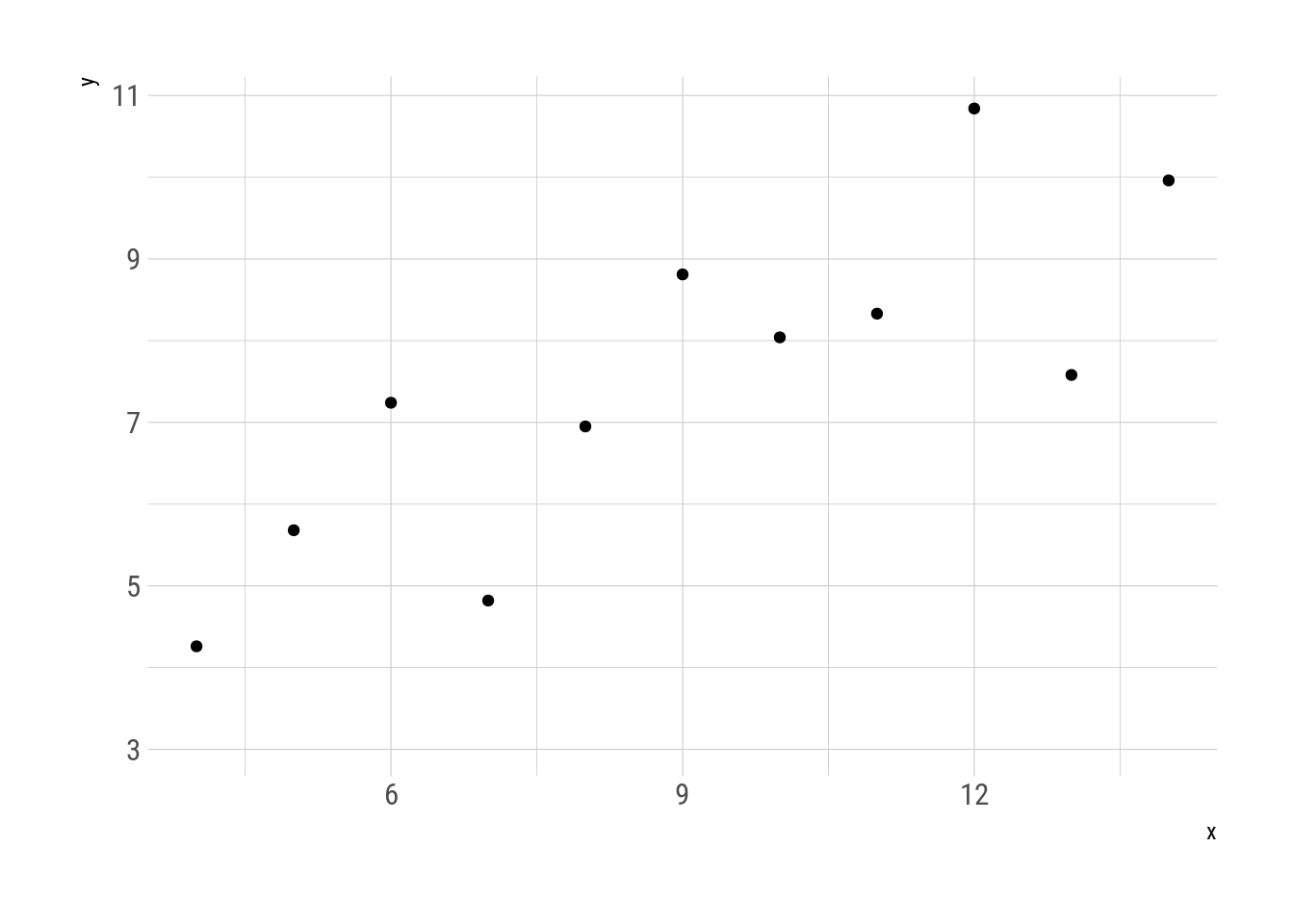
Fig. 3: Metamorphosys of the first two quartets.
The discussion around statistical metamerism is usually framed as the importance of visualising data instead of relying on summary statistics. Anscombe created his quartet to rebut the idea that “numerical calculations are exact, but graphs are rough”. Now this is still the interpretation of the phenomenon:
)](../../../../images/datasaurus_tweet.png)
Fig. 4: Download the datasaurus. (Tweet)
However, I believe there is a more fundamental principle at play. The problem with summary statistics is the summary part. In many cases, the role of statistics is to sum up data. To take a big set of observations that cannot be grasped in their entirety because the limitations of our comprehension, and condense them into a few numbers or properties that we can easily get. The problem is that what is gained in understanding is lost in information.
For example, a complete earnings census is a huge amount of data, but as raw numbers they are impossible to understand. One can start by taking the average (first moment) to get some idea of the “typical” earning of a citizen. Of course, this single number hides a great deal of income inequality, so one can compute the standard deviation (second moment) to get an idea of the variability. It is very likely, though, that the distribution is not symmetrical, and one can use the skewness (third moment) to quantify that.
With each subsequent moment one can get a richer picture of the underlying data. The limit is when one has the same amount of moments as the sample size. A single univariate sample of size N can be unequivocally described by its N first moments. This makes sense intuitively –why should you need more than N numbers to describe N numbers?– but it can be demonstrated1.
In other words, the transformation “first N moments” has no metamers for samples smaller than N, except for any permutation of the same sample (but see 1).
But this property is not exclusive to statistical moments. The same goes for the fourier transform, principal component analysis, factor analysis, clustering, etc….2 The issue is not plots vs. numbers but “all the numbers” vs. “just some numbers”. The big advantage of plots is that they can show an enormous amount of numbers efficiently and intuitively, in addition allowing to see a gestalt that is impossible to get by just looking at series of numbers.
With this in mind, it is possible to predict when it will be easy to find metamers and in which cases it is a mathematical impossibility. For example, it is impossible to find metamers of a sample of size 10 that preserves 10 moments.
set.seed(42)
start_data <- data.frame(x = rnorm(10))

metamerize(start_data,
           moments_n(1:10),
           signif = 3,
           perturbation = 0.05,
           N = 30000)
## List of 1 metamersBut it is possible to find metamers that preserve just two.
set.seed(42)
metamerize(start_data,
           moments_n(1:2),
           signif = 3,
           perturbation = 0.01,
           N = 30000)
## List of 310 metamersBoxplots try to represent a sample with about 5 numbers. Hence, it is expected to have metamerism for samples with \(N>5\). A density estimation using parametric methods, on the other hand, can be evaluated at potentially infinite points even for small samples. The possibility of metamerism in this case depends on the “resolution” with which the curve is described. If it is rendered with fewer points than the sample size, then it will metamerise.
coarse_density <- function(data) {
   density(data$x, n = 16)$y
}
set.seed(42)
metamerize(data.frame(x = rnorm(100)),
           preserve = coarse_density,
           N = 5000,
           signif = 3,
           perturbation = 0.001)
## List of 11 metamersHowever, if it is rendered with more points, it will not metamerise.
highdef_density <- function(data) {
   density(data$x, n = 200)$y
}
set.seed(42)
metamerize(data.frame(x = rnorm(100)),
           preserve = highdef_density,
           N = 5000,
           signif = 3,
           perturbation = 0.001)
## List of 1 metamersThe general principle works, but it is not complete. Imagine a statistical transformation defined as the sample mean repeated N times. Even though it returns N numbers from a N-sized sample, it does not have more information than just the mean. Generating metamers is then trivial.
mean_n_times <- function(data) {
   rep(mean(data$x), length.out = length(data$x))
}
set.seed(42)
metamerize(data.frame(x = rnorm(100)),
           preserve = mean_n_times,
           perturbation = 0.1,
           N = 1000)
## List of 43 metamersThis motivates to define the category of “effective” statistical transformations as transformation that can uniquely describe a univariate sample of size N with, at most, N numbers. Under this definition, “the first N moments” is effective, while “the first moment repeated N times” is no. At this point, this is pure speculation, so take it with a grain of salt.
It is worth noticing that when searching for metamers empirically there is a need to set the numerical tolerance (with the argument signif). Being pedantic, these are more like “semi-metamers” than true metamers. With a high enough tolerance it is possible to find (semi) metamers even when it should not be possible.
set.seed(42)
metamerize(data.frame(x = rnorm(3)),
                       moments_n(1:4),
                       signif = 1,
                       perturbation = 0.001,
                       N = 1000)
## List of 1000 metamersAdvanced metamers
I would like to close with a showcase of some utilities in the metamer package. draw_data() opens up a shiny interface to freehand draw datasets with an optional dataset as backdrop.
start_data <- subset(datasauRus::datasaurus_dozen, dataset == "dino")
start_data$dataset <- NULL

smiley <- draw_data(start_data)
simley$.group <- NULL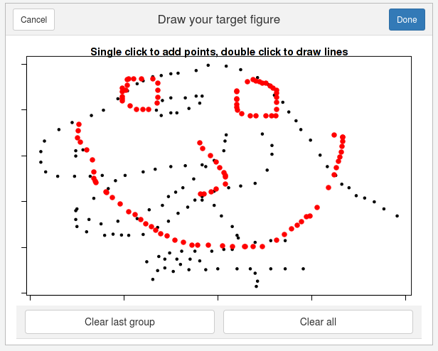
Fig. 5: draw_data() interface.
Moreover, metamerize() can be piped, saving the parameters of each call (except N and trim). This way one can perform sequences.
X <- subset(datasauRus::datasaurus_dozen, dataset == "x_shape")
X$dataset <- NULL

star <- subset(datasauRus::datasaurus_dozen, dataset == "star")
star$dataset <- NULL
metamers <- metamerize(start_data,
preserve = delayed_with(mean(x), mean(y), cor(x, y)),
minimize = mean_dist_to(smiley),
perturbation = 0.08,
N = 30000,
trim = 150) %>%
metamerize(minimize = NULL,
N = 3000, trim = 10) %>%
metamerize(minimize = mean_dist_to(X),
N = 30000, trim = 150) %>%
metamerize(minimize = NULL,
N = 3000, trim = 10) %>%
metamerize(minimize = mean_dist_to(star),
N = 30000, trim = 150) %>%
metamerize(minimize = NULL,
N = 3000, trim = 10) %>%
metamerize(minimize = mean_dist_to(start_data),
N = 30000, trim = 150)This metamers show the datasaurus metamorphosing into different figures, always preserving the same statistical properties. This replicates Justin Matejka’s y George Fitzmaurice’s animation
metamers %>%
   as.data.frame() %>%
   ggplot(aes(x, y)) +
   geom_point() +
   transition_manual(.metamer)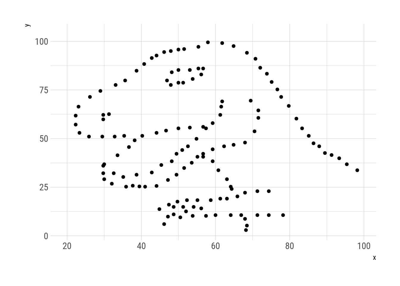
Fig. 6: Datasaurus metamorphisis.
References
Anscombe, F J. 1973. “Graphs in Statistical Analysis.” The American Statistician 27 (1): 17–21. https://doi.org/10.1007/978-3-540-71915-1_35.
Chatterjee, Sangit, and Aykut Firat. 2007. “Generating data with identical statistics but dissimilar graphics: A follow up to the anscombe dataset.” American Statistician 61 (3): 248–54. https://doi.org/10.1198/000313007X220057.
Govindaraju, K., and S. J. Haslett. 2008. “Illustration of regression towards the means.” International Journal of Mathematical Education in Science and Technology 39 (4): 544–50. https://doi.org/10.1080/00207390701753788.
Haslett, S. J., and K. Govindaraju. 2009. “Cloning data: Generating datasets with exactly the same multiple linear regression fit.” Australian and New Zealand Journal of Statistics 51 (4): 499–503. https://doi.org/10.1111/j.1467-842X.2009.00560.x.
Hunt, R. W. G. 2004. “The Colour Triangle.” In The Reproduction of Colour, 6th ed., 68–91. https://doi.org/10.1002/0470024275.
Matejka, Justin, and George Fitzmaurice. 2017. “Same Stats, Different Graphs.” Proceedings of the 2017 CHI Conference on Human Factors in Computing Systems - CHI ’17, 1290–4. https://doi.org/10.1145/3025453.3025912.
Technically, the solution is unique up to any permutation. This is not an accident. If the order matters, then it is a case of bivariate samples (each “datum” is actually a pair of values (x; y)). Intuition tells that besides the moment of each variable, the joint moments (covariance and such) are needed. So it seems plausible that in this case the matrix \(A^{N\times N}\), where the element in the ith row and jth column is \(x^iy^j\) would be needed; which implies the need of \(N^2 -1\) moments.↩
The fourier transform case is interesting because it describes an ordered sample of size \(N\) with two ordered series of \(N/2\) numbers (one real and one imaginary) which sum up to \(2N\) numbers (the two series plus their respective order). This is much less than the assumed \(N^1-1\) needed in general. I suspect that this is because for this to happen, a regularly sampled series is needed. With this restriction, the fourier transform can “compress” the information.↩

